Brand kit
Build in the RheumAI brand
Tokens, typography, logo and the rules that hold them together. Everything here is read from the live site, so it is always current.
Wordmark
"RheumAI" in Funnel Display 500, tracking −0.025em. "Rheum" in the foreground ink, "AI" in brand blue, no space, with the logo mark to its left. Funnel Display is used for the wordmark and nothing else.
 RheumAI RheumAI
Color
One brand hue, Cobalt Blue #3333DE, used as a fill and as thin text. Green, amber and red are status only. Author against the token names, never raw values.
Light theme
-
--background
#EBEEF4
-
--surface
#FFFFFF
-
--surface-2
#E2E6F0
-
--surface-brand
color-mix(in srgb, var(--primary) 14%, var(--surface))
-
--foreground
#14161C
-
--foreground-soft
#545B6B
-
--muted-foreground
#646B7D
-
--rule
#CDD4E0
-
--border
color-mix(in srgb, var(--foreground) 16%, transparent)
-
--primary
#3333DE
-
--primary-foreground
#FFFFFF
-
--primary-ink
#3333DE
-
--accent-text
var(--primary-ink)
-
--accent-on-dark
#5A5AFF
-
--foreground-on-dark
color-mix(in srgb, var(--primary-foreground) 86%, transparent)
-
--muted-on-dark
color-mix(in srgb, var(--primary-foreground) 72%, transparent)
-
--primary-soft
color-mix(in srgb, var(--primary) 10%, transparent)
-
--ink-black
#07090A
-
--ok
#1F7A54
-
--attn
#9C6A15
-
--spot
#C1362B
Dark theme
-
--background
#141621
-
--surface
#1D2231
-
--surface-2
#262C3C
-
--surface-brand
color-mix(in srgb, var(--primary-ink) 12%, var(--surface))
-
--foreground
#E9EBF2
-
--foreground-soft
#A2A9BA
-
--muted-foreground
#808799
-
--rule
#363D4F
-
--primary-ink
#5A5AFF
-
--ok
#57C89A
-
--attn
#E0A24A
-
--spot
#F0796B
Typography
Serif reads, sans is scanned: Source Serif 4 for headings and editorial prose, Manrope for all UI and data, Funnel Display for the wordmark only.
-
display
Source Serif 4 Variable
500 · clamp(2.25rem, 7vw, 4.5rem) · 1.1
Elevate your practice
-
headline
Source Serif 4 Variable
500 · clamp(1.875rem, 4vw, 3rem) · 1.1
One consult, three outputs
-
title
Source Serif 4 Variable
500 · clamp(1.5rem, 2.5vw, 1.875rem) · 1.2
The record you approve
-
body
Manrope Variable
400 · 1rem · 1.6
Delegate the manual work and focus on what only you can do: your patients, your research, and your life outside the clinic.
-
label
Manrope Variable
600 · 0.75rem
Request access
-
wordmark
Funnel Display Variable
500
RheumAI
@fontsource-variable/source-serif-4: Headings and editorial prose, weight 500. Italic only for the brand accent word.@fontsource-variable/manrope: Body, UI and all data (tabular-nums on figures).@fontsource-variable/funnel-display: The wordmark only. Never for anything else.
Shape and elevation
Zero radius everywhere. Framed cards lift with exactly one soft shadow; everything else separates with a hairline rule or the brand tint.
Card
--surface, 1px --rule border, the one shadow, square corners.

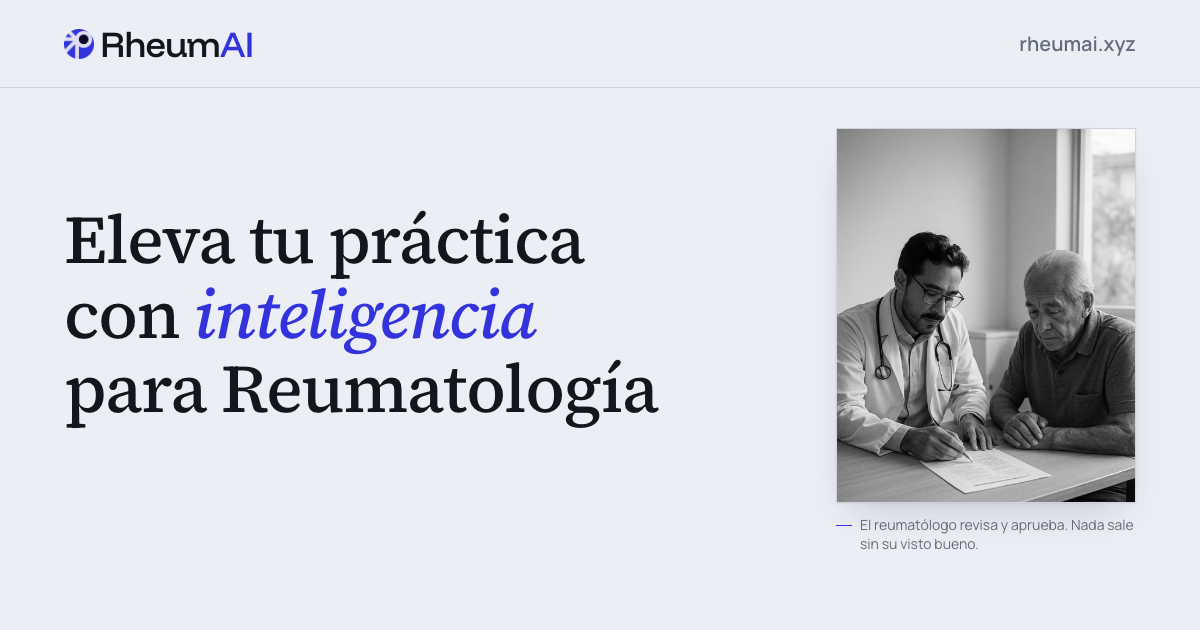

Full guidelines
Design System: RheumAI
Overview
Creative North Star: “The Frontier Lab Notebook”
Cool, precise, human-first. A cool blue-biased off-white by day and a softened indigo-dark by night, never warm paper. It reads like a working instrument for a specialist who stays at the leading edge of the field: one calm blue voice, serif for what is read and sans for what is scanned, zero radius, and exactly one soft shadow on framed surfaces with hairlines everywhere else. The surface is quiet so the clinical objects on it (the record, the cited second opinion, the patient plan) carry the weight.
The system is deliberately restrained: brand appears as a single hue used sparingly, depth is one soft lift rather than a shadow vocabulary, and structure is expressed with hairline rules instead of boxes-in-boxes. It is the same system the RheumAI app uses, expressed here in the landing’s own semantic token names. It supersedes the retired “Clinical Broadsheet” print world (warm paper #F0EEF0, ink hairlines, a hard-offset shadow, paper grain), which this project no longer uses; if you see those, they are stale.
“Frontier” is the internal design codename and the brand’s north-star concept (staying at the leading edge). It is unaffected by the public-copy rule, which only disciplines the word in visitor-facing copy: never in Spanish, and in English only as earned supporting copy after proof.
Key Characteristics:
- Cool blue-biased off-white ground, never warm paper; surfaces separate by hue, not just lightness.
- One brand hue (
#3333DE), used as fill and as thin-text/marks; green/amber/red are status only. - Serif reads, sans is scanned: Source Serif 4 for headings/prose, Manrope for all UI and data.
- Zero radius everywhere; one soft shadow on framed cards; hairline rules elsewhere.
- Review, not data entry: every clinical object leads with the value and offers one confirm/correct action.
Colors
A near-monochrome cool field with a single saturated blue. The neutrals sit close together on purpose; hue and one shadow do the separating.
Primary
- Cobalt Blue (
#3333DE): the one brand hue. Used two ways: as a solid fill (--primary, always under white--primary-foregroundtext: the primary button, solid icon chips, the approval-gate accent) and as thin text and marks (--primary-ink/ its alias--accent-text: the wordmark “AI”, links, focus rings, citation indices, trace nodes, the italic heading accent). On dark grounds the thin-text tone lightens to Bright Cobalt (#5A5AFF,--accent-on-dark/--primary-ink-dark) so it stays legible.
Neutral
- Cool Off-White (
#EBEEF4,--background): the page ground. Blue-biased, never warm. - White (
#FFFFFF,--surface): framed/raised cards; lifts off the ground with the one shadow. - Quiet Panel (
#E2E6F0,--surface-2): recessed panels (the Ask question quote), flat. - Brand Tint (
--surface-brand,color-mix(--primary 14%, --surface)): faint blue emphasis panels (statements, mid-page secondary CTA, the patient-plan panel). - Ink (
#14161C,--foreground): primary text. - Soft Ink (
#545B6B,--foreground-soft): secondary text. - Muted (
#646B7D,--muted-foreground): meta / faint labels (darkened from#868D9Eto clear WCAG AA 4.5:1 on both surface and ground for small labels). - Hairline (
#CDD4E0,--rule): the divider token: every seam, grid line, and column rule. - Ink Black (
#07090A,--ink-black): the single always-dark band (the closing CTA), fixed in both page themes.
Status
- Green (
#1F7A54,--ok): confirmed / complete. - Amber (
#9C6A15,--attn): the default “needs you / missing-but-not-blocking.” - Red (
#C1362B,--spot): rationed editorial red, true blockers only.
Theme-aware: bare :root is light; dark applies via @media (prefers-color-scheme: dark) on :root:not([data-theme="light"]) and via explicit [data-theme="dark"] from the persistent toggle (localStorage['pokta-theme'], pre-paint script to avoid FOUC). The full dark value set is in the frontmatter. The Tailwind v4 @theme primitives (--color-ink, --color-paper) are frozen at old hexes for lingering utility consumers and are not the system; author against the semantic tokens.
Named Rules
The One Voice Rule. The brand is one hue. --primary fills (both themes, always white text on it); --primary-ink carries thin text and marks. Green/amber/red are status, never brand; the brand is never a status color.
The Rationed Red Rule. Amber is the default “needs you.” Red is reserved for what truly blocks. Green confirms. Red that isn’t a blocker is a bug.
The Hue-Not-Lightness Rule. The neutrals are deliberately close. Never separate them by lightness alone; that reads cold and flat. A framed white surface lifts with the one shadow; emphasis sections carry --surface-brand.
The On-Dark Tokens Rule. The always-dark band (--ink-black, dark in both page themes) can’t use the light-theme thin-text tokens (they resolve to dark ink and fail). That surface uses three fixed on-dark tokens: --accent-on-dark (#5A5AFF) for the italic accent, --foreground-on-dark (86% white) for readable supporting copy, and --muted-on-dark (72% white) for muted meta. Supporting copy on the dark band is real, readable body text, never a faint sub-14px whisper.
Typography
Display / Heading Font: Source Serif 4 Variable (Georgia, Times New Roman fallback) Body / UI / Data Font: Manrope Variable (system-ui fallback) Wordmark Font: Funnel Display Variable: the wordmark only, nothing else
Character: An editorial serif for what is read and a precise humanist sans for what is scanned. Self-hosted via @fontsource-variable/{source-serif-4, manrope, funnel-display} (plus source-serif-4/wght-italic.css for the hero brand phrase). No Inter, ever.
Hierarchy
- Display (500,
clamp(2.25rem, 7vw, 4.5rem), 1.1): the heroh1only. - Headline (500,
text-3xl md:text-5xl≈clamp(1.875rem, 4vw, 3rem), 1.1): every section header. The closing CTA band is one step up (text-4xl md:text-6xl), the single largest type on the page. - Title (500,
clamp(1.5rem, 2.5vw, 1.875rem), 1.2): card and featureh3, Funnel-titled mock headers use the wordmark face. - Body (400,
1rem, 1.6): default paragraph and UI text (Manrope). Editorial lede/hero sub may be set in the serif; supporting measure ~46–62ch. - Label (600,
0.75rem,0.16em, uppercase): kickers, nav links, meta. Mock micro-labels run0.7remuppercase (sanctioned in.impeccable/config.json).
Named Rules
The Serif-Reads-Sans-Scans Rule. Serif for titles and editorial prose; Manrope + tabular-nums for every datum, name, value, and code. No clinical value or name is ever set in serif or italic. The one sanctioned italic is the hero/emphasis brand accent.
The Fixed Heading Tier Rule. Section headers are one size (text-3xl md:text-5xl, 500, -0.01em); the closing CTA band is the one deliberate step up. Do not introduce a fourth section-header size; a long header wraps, it does not shrink.
The Accent-Marks-the-Turn Rule. The italic --accent-text accent goes on the emphasis/turn headings (Hero, the Lede bridge, Audiences, Proof, the secondary-CTA panel, the closing band), one accent per heading on the load-bearing word. Structural section headers that merely name a section (Outputs, CareLoop, FAQ) stay plain.
Layout
A single centered column on a 24px gutter (px-6). Content holds to 1240px; emphasis and CTA bands narrow to 1080px; long-form prose (FAQ) uses an 860px reading measure. Vertical rhythm is ~80px per section (py-20 md:py-28), with a hairline --rule seam (border-b) between sections. Grids are built with gap-px over a --rule background so cell seams read as hairlines.
Section headers are left-aligned to the content column. Paired comparisons and statements are centered as a block with their text still left-aligned: the Lede before/after is a centered 50-50 unit whose hairline spine sits on the exact center with symmetric padding, so the two columns read as one pairing rather than being flung to the container edges.
Named Rules
The Left-Aligned Header Rule. Every section header (and its sub) aligns left. Centered text is reserved for emphasis/CTA panels, which are centered statements, not section headers.
The --rule Divider Rule. Every hairline seam, grid line, and column/list divider uses --rule (grids: gap-px over a --rule background). --border (--foreground 16%) is retained only for the estudio chart chrome; never reach for it as a section/layout divider.
Elevation & Depth
Flat by default. Depth is expressed with hue and hairlines, plus exactly one soft shadow on framed/active surfaces. No gradients, no paper grain, no hard-offset shadows, no second brand hue.
Shadow Vocabulary
- The one shadow (
box-shadow: 0 1px 2px rgba(20,22,28,.06), 0 18px 40px -16px rgba(20,22,28,.20); dark theme0 1px 2px rgba(0,0,0,.4), 0 18px 42px -16px rgba(0,0,0,.66)): the soft lift on.card(framed white surfaces). It is the only shadow in the system.
Named Rules
The One-Shadow Rule. A single soft lift on the active/framed surface; everything else separates with a --rule hairline or --surface-brand hue. The retired hard-offset 6px 6px 0 block shadow is banned.
Shapes
Zero radius throughout: a square corner everywhere (rounded.base = 0). Framed cards are --surface + a 1px --rule border + the one shadow; recessed panels are flat --surface-2; emphasis panels are flat --surface-brand with a 1px --rule border. Borders are hairlines; the only exception is the approval-gate cell’s 2px --primary top border (see Components).
Components
Buttons
- Shape: square (
0radius). Composed from a base.btnthat owns the tactile hover (brightness0.94) and active push (translateY(1px) scale(.99)); size/layout stay as per-call-site utilities. - Primary (
.btn-primary):--primaryfill +--primary-foregroundtext; brightens on hover. The one conversion action. - Secondary (
.btn-secondary): white--surfacefill + a full--foregroundink border +--foregroundtext; darkens slightly on hover. A real secondary defined by its ink border, never a ghost, never a faint tonal.
Navigation
- Sticky top bar on
--backgroundwith a--rulebottom seam; the wordmark left, uppercase0.8rem/0.12emlinks, then lang + theme toggles (always visible) and the primary CTA. Anchor links scroll with a68pxheader offset (scroll-padding-top). - Scrollspy active state: an IntersectionObserver marks the current section’s link with
--accent-textcolor + a2pxaccent underline (aria-current="true"). Reduced-motion safe (a class toggle) and it degrades to a plain nav without JS. - Mobile: a hamburger reveals a
--surfacemenu mirroring the links + CTA. This dropdown is the one place a soft shadow floats a menu.
Wordmark
“RheumAI” in Funnel Display 500, -0.025em; “Rheum” in --foreground, “AI” in --accent-text, no space, with a 20px logo ball to its left. Navbar and footer only; Funnel Display is used for nothing else.
Cards / Containers
- Corner: square (
0). Background:--surface. Border:1px --rule. Shadow: the one soft lift. Recessed panels drop the shadow and use flat--surface-2; emphasis/statement panels use flat--surface-brand+1px --rule.
The record mock (signature object)
A .card with a Funnel-titled header (muted patient/date), a --rule-divided list of labelled rows with --ok check icons, one “missing” row on a faint --attn tint (amber value + hint), and a footer action. States the completeness wedge: the value leads, the gap is legible, one confirm follows.
The second-opinion object (Ask) (signature object, the depth halo)
A .card docked to the case being completed. Header: a Funnel title with a small --accent-text chat icon and an Ejemplo/Example tag; a context line ties it to the same sample patient as the record. Inside, in order: the clinician’s question as a quote in a recessed --surface-2 panel (never an input field, so it never reads as an open chatbot); the reasoning .trace; the recommendation in sans; a Fuentes/Sources row of citation chips; a footer trust line (--accent-text shield + “RheumAI recommends; it never diagnoses. You decide.”). It lives on --background with the card carrying the weight, distinct from the --surface-brand bands around it.
The patient-plan mini-card
The counterpart artifact inside a --surface-brand panel with a solid --primary icon chip: a compact plan (medication / next visit / reminder) with --ok checks. The “one approved record → patient plan” output beside the clinician record.
Citation chip (.cite)
Square, 1px --rule border, --surface-2 fill, sans + tabular-nums: a bold --accent-text index (.cite-n) then the source label in --foreground-soft. Always shown beside a recommendation. Never rounded, never brand-filled.
Reasoning trace (.trace)
A calm vertical “steps it reasoned through” list. One hairline --rule connector runs the list height; each .trace-step carries a 7px square node outlined in --accent-text on a --surface ground. Sans, --foreground-soft, zero radius, no per-step animation beyond the global reveal. Placed inside a .card so the node’s fill cuts the connector cleanly.
Emphasis / statement panel
A --surface-brand bordered panel (1px --rule + the faint brand tint) for centered statements and mid-page secondary CTAs (the Lede bridge, the Outputs care-plan panel, the Audiences secondary CTA). Carries emphasis on the light ground without going dark.
The one dark band (closing CTA only)
--ink-black is the single deliberate always-dark surface, reserved for the final CtaBand: white text + --primary action + --accent-on-dark accent + a --foreground-on-dark supporting line. Never a second ink-black band mid-page; a mid-page CTA is a --surface-brand statement panel instead.
The approval-gate cell (sanctioned exception)
Inside the CareLoop hairline grid, the gate step (04 Aprobar) marks itself with a 2px --primary top border on a flat --surface cell instead of the card shadow, because a shadow would break the flush plane of a gap-px grid. The only white surface that isn’t a .card, and the only 2px border; intentional and scoped to the gate.
Status pills
Square; ok/attn/spot as a tint of the semantic color plus that color as text. Never the brand for status.
Do’s and Don’ts
Do:
- Do keep the brand to one hue:
--primaryfills,--primary-ink/--accent-textfor thin text and marks; status stays green/amber/red, red only for true blockers. - Do separate emphasis surfaces by hue (
--surface-brand), lift framed cards with the one shadow, and hold the 1240 / 1080 / 860 container rhythm on a 24px gutter. - Do set headings in Source Serif 4 (500), everything else in Manrope with
tabular-numson figures, and reserve Funnel Display for the wordmark. - Do keep supporting copy on the dark band readable (
--foreground-on-dark, ≥16px), and mark the active nav section with the scrollspy state.
Don’t:
- Don’t introduce border-radius, gradients, paper grain, hard-offset shadows, or a second brand hue.
- Don’t set a clinical value or name in serif or italic; don’t set a heading in a sans font; never introduce Inter.
- Don’t rely on lightness alone to separate the near-equal neutrals; use hue (
--surface-brand) or the one shadow. - Don’t add a second always-dark band; reserve
--ink-blackfor the single closing CTA. - Don’t use
--borderas a layout divider (it’s for the estudio chart chrome only); seams and grids use--rule.